What is the golden ratio and why do designers love it?
The golden ratio is a proportion of roughly 1 : 1.618 that has appeared for millennia in art, architecture, nature and the human body. Divide a line so the ratio of the larger part to the smaller equals the ratio of the whole to the larger part, and you get the golden ratio. The human brain perceives this proportion as naturally balanced, which is why designers use it to create compositions that simply “sit right with the eye”.
Where the golden ratio comes from
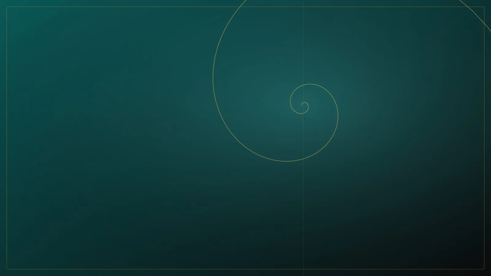
The golden ratio was known to the ancient Greeks — we find it in the proportions of the Parthenon. In the Renaissance, masters like Leonardo da Vinci studied it as a key to harmony and beauty; his famous Vitruvian Man is a study of ideal proportions. The same ratio appears in the arrangement of sunflower seeds, the spiral of a shell or the branching of trees. It’s not magic but mathematics, which nature and art independently discovered as a recipe for balance.
How we use the golden ratio in web design
In web design, the golden ratio serves as a quiet skeleton the visitor doesn’t see but feels. We use it on several levels:
- Typography. We derive font sizes from the golden ratio — heading to subheading to body text in a ratio that creates a clear, harmonious hierarchy.
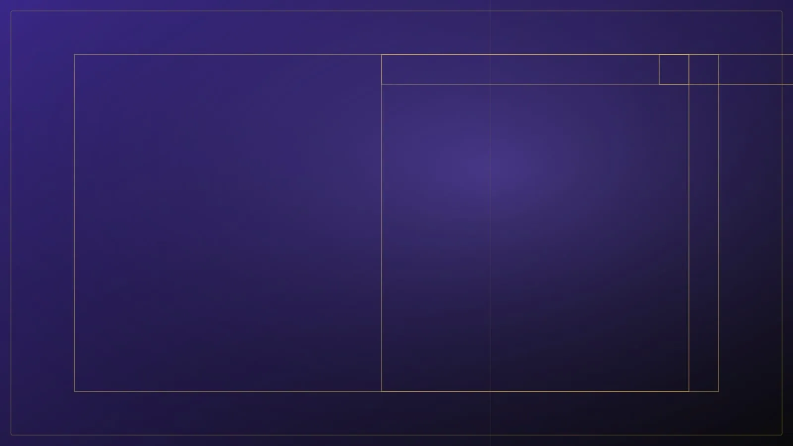
- Layout. We split main content and side elements at roughly 1.618 : 1, so the page feels balanced rather than random.
- Spacing and rhythm. We scale padding and gaps between sections by the golden ratio, creating a pleasant visual rhythm.
- Image composition. We place key elements at the points the golden ratio defines, much as photographers use the rule of thirds.
A guide, not a straitjacket
Importantly, the golden ratio is a tool, not a law. It serves as a starting point — a proportion the design begins from — which we then adjust to the content, feel and context. Slavishly matching the number to the decimal place would lead to a mechanical, lifeless result. Mastery lies in knowing when to keep to the ratio and when to deliberately break it. It’s in that balance between order and intuition that design which feels expensive and timeless is born.
Why this matters for your business too
The golden ratio isn’t an academic plaything. A site built on harmonious proportions feels professional and trustworthy before a visitor reads a single word. This subconscious first impression decides whether a customer stays and starts to trust you, or leaves with a sense that “something was off”. That’s exactly why, at Disegno, we build every site on proportions that have pleased the human eye for centuries.